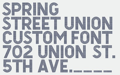
I guess I'm still in New York mode... I'm enamored by this custom typeface designed to look like tiled letters, which I'm sure is a reference to the tiled lettering all over the New York Subway system. The typeface was designed for the Spring Street Union by Ravi Hampole and Rebecca Alden. Nice website, too. [via The Serif]|DBK
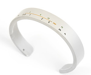
Here's a fun jewelry concept: Use your old camera lens as a bracelet or arm cuff. But if you don't feel like taking your camera apart, camera expert Craig Arnold has designed his own collection of camera lens bracelets calledRe:vision. You can get them right here. [via geeksugar] |DBK
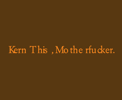
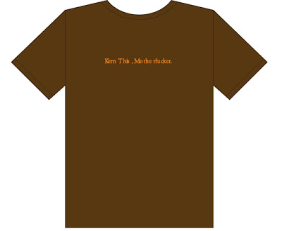
Ok, I literally shrieked when I saw this in the March/April 08 (I'm a little behind on my magazine reading) Stepmagazine. I have to have this shirt. Way to go DRDC, I'm such a fan. I've got your Hold Steady poster up in my living room right now. |DBK
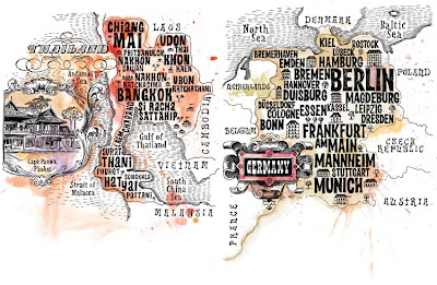
I came across this beautiful hand-drawn map on Ffffound.com today—it shows the growth and comparison of real estate markets in particular regions of Thailand and Germany. Fiodor Sumkin, an editorial illustrator based in Amsterdam, was commissioned to illustrate this map for the Aeroflot in-flight magazine. Along with his editorial work, he has an awesome collection of personal work in his online portfolio. |DBK
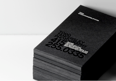
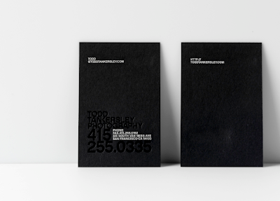 Oh, blind emboss, how I love you. Incredibly elegant, modern and beautiful, these business cards were designed for photographer Todd Tankersley as a part of his identity system. They were designed by Character, a San Francisco based agency, who has created materials for Nike, Levi's, Kohler and Pottery Barn, to name a few. [via The Serif] |DBK


 Oh, blind emboss, how I love you. Incredibly elegant, modern and beautiful, these business cards were designed for photographer Todd Tankersley as a part of his identity system. They were designed by Character, a San Francisco based agency, who has created materials for Nike, Levi's, Kohler and Pottery Barn, to name a few. [via The Serif] |DBK


