We Do Love Our Buttons


Trollbäck + Company endorses Barack Obama. Here are the buttons to prove it. |DBK

Fancy Barbecue


Austin, Texas based FÖDA Studio boasts quality over quantity when it comes to their work. The work ranges from identity to multimedia to environmental, encompassing the mix of eccentricity and charm that's found in Austin. A good example is this strangely elegant identity system for Lamberts Downtown Barbecue. The challenge: it had to feel "Austin," but also be true to the name—Fancy Barbecue. It's sophisticated and still welcoming—I think they worked it out. |DBK

Dinner for Neue


I got a slew of catalogs this weekend (we really are heading into the holiday season fast), and one of my favorite catalogs is from CB2, the funkier and younger brand from Crate & Barrel. From their new catalog is Subliminal Dinnerware and Verse Rug (above)—both fun and modern. You can check out the actual CB2 store in Chicago, New York or San Francisco or online at www.cb2.com. |DBK

Hope is Everywhere


What a funky poster by Chicago-based artist Cody Hudson. Want to add it to your 2008 political posters collection? You can buy it right here. [via Design*Sponge] |DBK

Mmm... Zingy


This is a pretty fun idea—Wine Tasting Coasters that poke fun at wine tasting clichés. I'd say it's a fun conversation starter... not that you'll need one after a glass or two of a bosomy red. Each pad of 36 paper coasters contains 6 each of 6 quotes. Get it at Paper Source for just $12.50. |DBK

Three Design Reads

Three design books I yearn for:

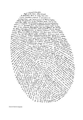
1. Daniel Eatock's Imprint is a collection of thoughtful, witty, and conceptual work. Blurring the lines of what is art and what is graphic design, Imprint showcases Eatock's unconventional work, some for clients, and some for himself.


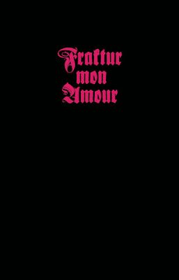
2. Berlin-based graphic designer Judith Schalansky loves Blackletter type, and she professes this love in her book Fraktur Mon Amour. Here you'll find 300 variations of Blackletter type, ranging from historical instances to contemporary usage.


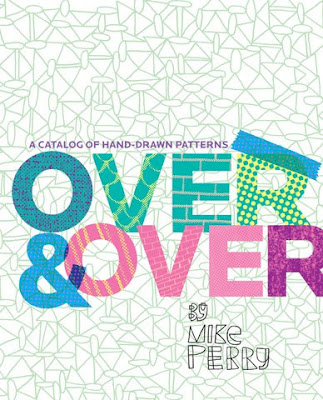
3. From the guy (Michael Perry) who brought you Hand Job: A Catalog of Type, is Over and Over: A Catalog of Hand-Drawn Patterns. If these hand-drawn patterns are as fun and vibrant as the hand-drawn type in the last book, I'm sold.

To buy any of these books, or to just get more information, check out Princeton Architectural Press|New Releases. |DBK

Possible


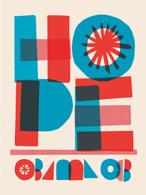
A couple of people have sent me a heads-up on this poster, and it's been all over design blogs since last week. Here we have a poster designed for the Obama campaign by Jonathan Hoefler of Hoefler & Frere-Jones. Buy it now from the Obama for America website (only 5,000 were printed). Thanks Erin B. & Jason L.! |DBK

Japanese Matchbox Labels


So cool—a Flickr set of Japanese matchbox designs. [via Speak Up]|DBK

Functional Typography


I saw this on Fubiz.net, and since the description is in French, here's my best guess at what I just read: Julien De Repentigny designed an identity system for the Westwood Hotel Montreal, inspired by his collaboration with designer Gabriel Lefebvre.
In my own words: It's beautiful. |DBK

Typecasting Mad Men


For you Mad Men fans, here's a fun write up about the typography used on the show—in the props and in their titles. [Via Design Observer|DBK

Get out the Vote 2008


Over the last few months, AIGA has invited U.S. designers to create nonpartisan posters that inspire the American public to get out and vote. If you're an AIGA member, you can still contribute your own designs. AIGA encourages everyone to download and print out your own favorites and distribute and/or hang them in your neighborhood. Shown above are my favorites from the set of 24 posters that were chosen for professional printing and national distribution in September. And if you get the chance, visit the Get Out the Vote exhibition at the AIGA National Design Center in New York. |DBK

&


Found: a blog dedicated solely to the Ampersand. There really is a blog for everything. There are some really lovely instances shown here.
Curious about the origins of the ampersand? Wikipedia has a thorough summary. |DBK

Points and Paths—Can you Handle It?


A useful guide to spotting and fixing common vector drawing mistakes, particularly when working with type. Thanks, Erin! [via Typies]|DBK
Related Posts Plugin for WordPress, Blogger...