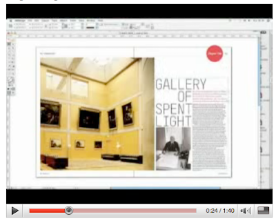
One of the quips on Speak Up today was a link to this time-lapse video of designing a magazine spread. I like it because it shows how much thought and detail goes into designing just one spread of an entire magazine. It also shows how flexible a designer has to be while still maintaining a consistent design style. I like to think of page layout as a puzzle that need to be put together, and once you have every piece in there just so, there seems to be no other way it could have been put together. |DBK

No comments:
Post a Comment